ShopLab

UX/UI Design | 24-hour Multidiscipline Hackathon

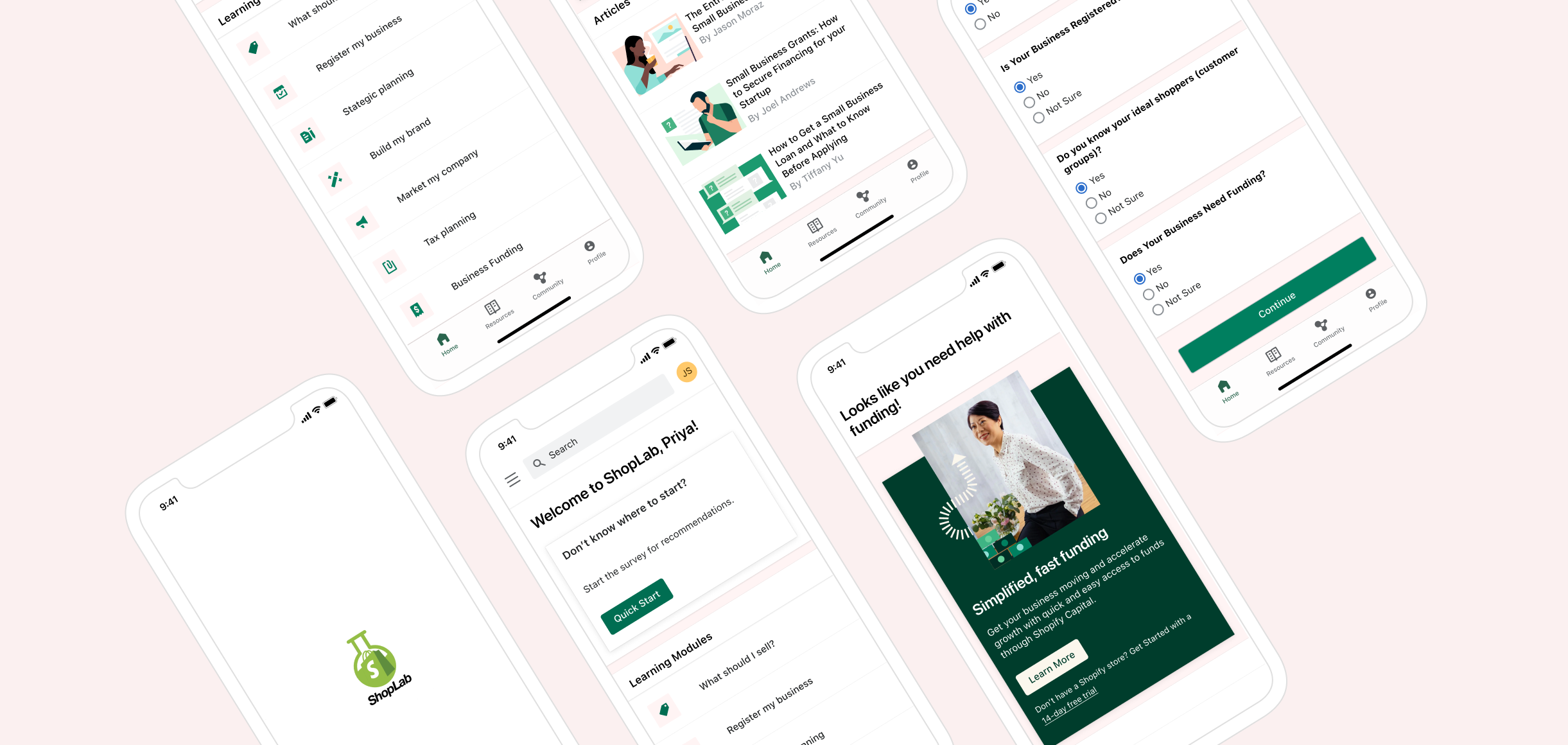
ShopLab is a stand alone app designed for Shopify. The app prepares potential merchants for entrepreneurship and helps them with setting up their business on the Shopify platform.


Project Overview

Project: Shopify Hackathon

Team: 2 UX/UI Designers | 1 Data Scientist | 2 Web Developers

Role: UX/UI Designer (1 of 2)

Timeline: 24 hrs

Tools: Figma | Zoom | Zeplin

Platform: iOS


A 24-hour remote hackathon with a multidisciplinary team of UX designers, web developers and a data scientist. As part of BrainStation’s collaboration with Shopify, students were asked to produce a digital solution to leverage Shopify’s current ecosystem.

Constraints:

  • adhering to the Shopify brand guidelines and design system

  • tight timeline of 24 hours

  • remote collaboration with team members in different time zones

The project included research, ideation, interface design, a high-fidelity prototype and a final presentation to Shopify.

Introduction

Shopify is an all-in-one e-commerce platform that makes it easy to launch your dream business and start selling to your customers, wherever they are. Shopify merchants have access to the robust Shopify Ecosystem, a network of partners that includes developers, designers, educators, content creators, consultants and other entrepreneurs. The network combines Shopify's app store, theme store, affiliate program and experts marketplace.

Design Challenge

For this hackathon, Shopify asked, “How can you imagine Shopify using its Ecosystem to help lower the barrier to entrepreneurship in entirely new regions, demographics and business sectors?” and provided the following problem statement:


How might Shopify better leverage its Ecosystem to make entrepreneurship more accessible than ever before?


Design Process

The design process isn’t always linear. Given the short timeframe, we focused on the key processes that were most beneficial to the challenge. This ensured that our web developers had sufficient time to implement the design and that all deliverables, including a slide presentation, would be ready to present by the deadline.

Empathize

Problem Space | Secondary Research

Problem Space + Secondary Research


As a team, we conducted secondary research on multiple topics to learn as much about the problem space as possible. We discovered that most Shopify sellers are first-time entrepreneurs. With this knowledge and the task of lowering the barrier to entrepreneurship in mind, we decided to focus on key challenges that new or budding entrepreneurs face when starting their business.

Common Barriers to Entry


Financing

$18,000 is the average cost to run small business in the first year. Many entrepreneurs are unable to access financing.

Social Support

75% of small business owners lack a business network or peer group and therefore have no social support.


Knowledge

45% of those considering entrepreneurship don’t know where to begin and lack the essential knowledge to get started.

Define

Refined Design Challenge | User Persona


Refined Design Challenge


How might we help emerging entrepreneurs overcome common barriers in order to start their businesses on the Shopify platform? 


User Persona

With our research findings, we developed a persona to represent the main frustrations and goals of our target user. Meet Priya! An artist who is looking to expand her business and take the first steps toward building her brand online.

Ideate

Solution | Task Flow

Solution

After looking at the data, the team held a brainstorming session. All agreed the strongest solution would be a simplified starting point for emerging entrepreneurs. We developed an easy 3 step process for them to move ahead with their business on the Shopify platform.

Our challenge would be appeal to entrepreneurs at any stage in their journey and provide a solution that is unique to their situation.

Task Flow

In Priya’s case, since she doesn’t know where to start and needs funding, the app would connect her with Shopify Capital and provide articles related to the topic to expand her knowledge.

This would break down two of the major barriers, lack of knowledge and access to funding.

Once the task flow was complete, we reconvened with our developers before moving forward with designing the screens.

Prototype

Visual Identity | Mid-fidelity Wireframes | Hi-fidelity Prototype

Visual Identity

An important aspect of the challenge was to adhere to Shopify’s brand guidelines and their existing Polaris Design System. Our solution was designed with Shopify’s colours, typography, icons and other design components.


Mid-Fidelity Wireframes

After quickly drawing preliminary sketches, the other UX designer and I got to work designing the mid-fidelity screens based on the task flow. Again, we checked in with our web developers for a final look-over before fully designing the high-fidelity prototype.

High Fidelity Prototype

After confirming with the developers that there were no issues with the functionality of the app, we moved ahead and produced a high-fidelity prototype.


Key Feature

ShopLab was designed to help emerging entrepreneurs overcome common barriers in order to start their businesses on the Shopify platform. A simple 3-step process, including a quick start button, a brief questionnaire and a recommendation in the form of a callout card to address the entrepreneur’s individual needs and help them to take the next right step for their business.

Through the UX design process and the creation of ShopLab, our team was able to successfully produce a solution for Shopify’s design challenge, ultimately leveraging Shopify’s ecosystem to make entrepreneurship more accessible than ever before.

MAIN FEATURE

Quick Start

Let’s help you take the next step! Answer a few questions and we’ll provide a recommendation on where to begin.

Moving Forward

Next Steps

With more time, we would…

  • expand the focus of the app for community building and support groups. 

  • use Data & Machine Learning, so that the app could make other recommendations that would benefit entrepreneurs. For example, ‘What’s Trending Now’, ‘Sellers Similar to You’, and ‘Ways to Improve Your Store’.

Key Learnings

Effective Collaboration

This project was a wonderful learning experience! Working collaboratively with web developers during the design stage and going through the process of handing off the design to be developed was an invaluable experience. Each team member brought their strengths to the project. Through consistent communication, we were able to produce a viable product and address the original design challenge.

Using Existing Design Systems

I learned how to use an existing design system to create a better user experience and interface. Learning about Shopify’s brand guidelines and using their Polaris Design system not only enhanced my productivity and efficacy when designing for Shopify, it provided inspiration for how I can design simple, intuitive experiences moving forward.